The choice of gold wallpaper for the walls, photos in the interior. Golden wallpaper in the interior of the living room, bedroom, kitchen Wallpaper brown with gold on the hall
It is easy to give the room a royal chic. Gold wallpapers will help to bring an atmosphere of luxury, prosperity and well-being into the interior.

Peculiarities
The golden color is associated with sunlight, warmth, joy. In the interior, it also reminds of the luxury of gold, wealth and prosperity.
The noble metallic shade stimulates activity and determination, inspires confidence and calmness. The design of the room with such wallpaper makes an impression elite, expensive and unique.


The golden palette is complex and multifaceted - it is muted light yellow, and rich amber, and dark bronze shades. The characteristic gloss of the surface attracts attention and fascinates. Depending on the lighting, the wallpaper changes its appearance- from a slight shimmer to radiant overflows.
Shiny canvases reflect the light that visually enlarges the room, making it brighter and more comfortable. The feeling of spaciousness allows the golden hue to look equally great in large living rooms and miniature bedrooms.
Particularly impressive golden wallpaper fit into a classic setting. However, the variety of design options allows you to decorate with such canvases rooms of almost any style.


Styles
The appearance of golden wallpaper may be different depending on the interior:
- The classic style involves elegant gold ornaments (medallions and damasks) on a white, beige, blue, burgundy or green background.
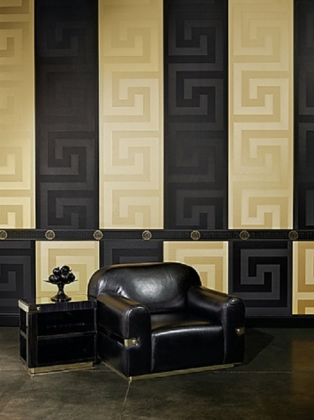
- Art deco wallpapers can have similar patterns, but in this case the contrast is much more pronounced. The main background here is usually black and brown.


- Modern welcomes plain wallpaper with embossing. Modern gold prints on a white background and variants with an optical 3D effect are also acceptable. Geometric shapes, stripes, floral patterns - the choice of models is very wide.
- Minimalism and high-tech styles are characterized by smooth textures.


Rules for using a golden hue
Gilding in the interior is good only in moderation. The predominance of golden tones makes the atmosphere heavier and makes it tasteless. The optimal amount of a brilliant shade, on the contrary, gives the interior elegance, fills the room with light. The best ratio is 1/3.
This can be achieved by choosing wallpaper with a discreet gold pattern or asymmetrical wall decoration (emphasis on individual areas).


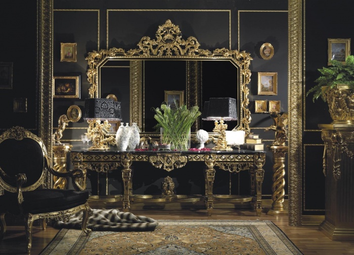
Do not get carried away and gold accessories. Even in a baroque interior, such wallpapers should not be combined with gilded furniture details, chandeliers and other decorative elements (or do it very carefully, observing the measure).
Also, do not forget about the unity of style, the combination of wallpaper design with furniture, curtains and other components of a harmonious environment.


Golden color in different rooms
Bedroom
This room is for relaxation. Shimmering gold wallpaper will help turn the bedroom into a fabulous sophisticated apartment. In such an environment, you can enjoy sleep, feeling like a regal person.
Light colors and a print with a subtle sheen are preferred here. A bright glow is not suitable here, as it will interfere with relaxation. The same applies to contrasting tones, which are out of place here.
Usually one of two finishes is used. The first is to highlight the wall above the head of the bed with gold. Other walls of the room are decorated with plain white, beige or cream wallpaper. The second design option allows pasting all the walls with light wallpaper with a golden print.


Living room
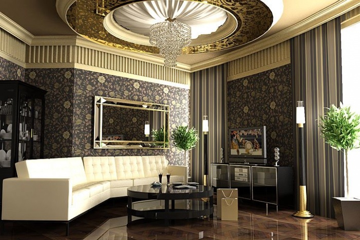
In the living room, luxurious wallpaper with a golden sheen will be very appropriate. They will create a solemn atmosphere for receiving guests, they will tell about the aristocratic taste of the owners of the house.
Here you can focus on elegance and even a little pomposity. Spectacular contrasts are acceptable. Great for this suitable furniture from an array in dark colors.


The wallpaper can be either completely gold or have a main color with a golden print. The background can be neutral light colors, and dark shades. The choice depends only on the size of the room and personal taste. In a spacious hall, the color of the wallpaper can be any. If the room does not differ in large dimensions, it is better to opt for a light color scheme.
In the living room, gold can be present not only on the walls, but also in other elements. It can be vases, furniture fittings, lamps and so on. The main thing is to remember about balance and observe moderation.


Kitchen
Golden gloss in the kitchen is not a very good solution. After all, many brilliant details are already used in the design of this room. However, if you really want to add a little glamor to the interior, you can choose golden matte wallpaper with a discreet pattern. This will give the space depth and a special mood.


Hallway
The entrance room is the first thing that guests of your house see. It also sees off and meets the owners themselves every day. Gold wallpaper can charm at first sight, enchant with brilliance and cause a desire to return.
Here it is only important to take into account the size of the room. IN small corridor it is better to choose not too shiny wallpaper without a pronounced pattern. In a spacious hallway, a large print would also be appropriate.
Also, do not forget about practicality. In the corridor, as in the kitchen, the best choice washable wallpaper. They are easy to keep clean, because an impeccable appearance in a golden interior is especially important.


Combination with other shades
To visually expand the room and add light to it, you need to pay attention to light colors. White, cream, milky, peach, beige colors are perfectly combined with gold. This combination makes the interior light and elegant. This applies to the wallpaper itself (for example, a golden print on a white or beige background), and to interior items.
Snow-white furniture, as well as natural light shades of wood, are in perfect harmony with golden wallpaper (“ bleached oak"and others), sofas, armchairs, pouffes with light upholstery.


A luxurious duet creates a combination of gold and brown colors. Can be matched to gold wallpaper beautiful furniture in shades of brown, or you can decorate the walls with chocolate-colored wallpaper with a golden print.
The first option is ideal for small spaces. It allows you to visually increase the area of \u200b\u200bthe room and effectively place accents. The second option will make the room shockingly luxurious. Usually this technique is used in the Art Deco style.


Another no less spectacular option is a combination of gold and black. Such an interior looks stylish and expensive, but it is important to strike a balance here. Colors should either be used in equal proportions, or black should be less than gold.
The combination of golden hue with deep blue is suitable for decorating living rooms in a classic style. This combination looks elegant and noble, emphasizing the luxury of gold details. The union of gilding with pale blue is suitable for Provence-style furnishings.


Burgundy is another classic shade. It makes the room respectable, creates a mood of solemnity. However, due to the saturation of the color, it is recommended to use it in moderation, diluting the interior with other colors.
Golden color is rarely combined with green. For classic interiors in this case, calm, soft shades are suitable. Dark green creates a solid interior, pistachio looks gentle and romantic.
Gold and turquoise are a bright option for modern styles. Can also be used grey colour. This will give the atmosphere austerity and balance the brightness of the gilding.


How to choose curtains?
When choosing a curtain design, you need to focus on the style of the room. As for the material, it should be dense. Light translucent curtains will conflict with the design theme and look out of place.
Tulle is acceptable here, but only complete with night curtains. At the same time, it must be white, plain and not too lush.
Gold in the interior has always been associated with wealth and luxury, and at one time it was quite actively used in decoration - we are talking about prints on wallpaper, as well as finishing furniture and chandeliers.
But fashion is changing, and today this color is found mainly on wallpaper. Other options for including gold in the design of rooms are rarely used. Today we will talk about the use of gold-colored wallpaper in the interior.
Decoration of different rooms. Gold wallpaper in the interior


Hall and hall, bedroom
Gold wallpaper is produced in a variety of textures and shades, from polished, light gold to muted, matte. For example, gold wallpaper for walls with shiny elements is best used in halls and halls. The type of drawing is selected depending on the overall design of the room:
- Modern styles - floral or abstract pattern.
- Classical or baroque style - classic pattern.

Golden wallpaper in the interior. Hall photo
For the bedroom, it is better to choose wallpaper with an aged gold color pattern, almost without shine. A shiny print would be out of place here, as the glare from the finish can place good rest eye. You can choose from two finishes:
- With a very thick pattern or all gold - in the form of a panel above the head of the bed. The rest of the walls in the bedroom are pasted over with light wallpaper in white or cream color.
- With the main white color, along which the gold print goes, all the walls in the bedroom are finished.
The type of pattern is selected according to the same principle as above for halls and halls. If it is for children, then the pattern can be anything: birds, fish, etc.

Gold wallpaper in the bedroom: photo of a classic print option
Kitchen and corridor
In the kitchen, gold-tone wallpaper for walls is used quite rarely. This is due to the fact that in the design and arrangement of the premises a large number of small parts often lustrous. Therefore, it can be quite difficult to choose wallpaper with a gold print here. Best suited for the kitchen finish with a discreet, pale pattern. Or we take completely plain, but also not bright shades.

Vinyl golden wallpaper in the interior. Kitchen photo
And in the corridor it all depends on its size. Narrow and small rooms are best finished with golden wallpaper without a pronounced pattern, with a slight sheen. You can see a good example in the photo below. A large print will be easier to perceive in spacious hallways.

Wall decoration in the corridor
Perception of golden color in the interior
As mentioned in the introduction to this article, gold in the interior evokes strong associations with luxury or even some pomposity. And what's more, we are often afraid of getting finishing works the so-called "barbarian splendor". Therefore, many refuse such decoration in the design of apartments. However, the problem can be solved by the correct use of color.
Note:gold in the interior will be quite appropriate if you follow the “1/3” rule. That is, this color should not dominate, it should be used in moderation. In addition, we choose what will be emphasized. Or we use wallpaper with gold on the walls, or we select decor and accessories “under gold”.
Burgundy wallpaper with gold pattern in the bedroom
Gold will look equally good both in large halls and in very modest-sized rooms. Due to the reflection of light, the room will always look more spacious, airy. In this case, the design can be done in different styles up to futurism. Only the shade and degree of gloss changes.

Room interior with golden wallpaper
Combining gold wallpaper with other colors. patterns
These wallpapers are used not only on their own, but also in combination with wallpapers of other colors. Next, we will talk about the most popular color combinations, as well as the most commonly used print options.
Wallpaper combination: gold with other types
The most popular combination is gold plus any shades of white or light beige or gray. Moreover, golden wallpaper is always with an ornament, and the finish of a different color is plain, matte. As a maximum, drawings created not by color, but by texture are acceptable.
In the photo below - a fairly common version of the design of the walls. Its popularity is understandable: the brightness of the ornament softens against the background. white color, and the result looks rich, but without the "gypsy". This combination is equally well suited for the bedroom and living room. The only difference is that in the hall you can afford brighter versions of the drawings.

Wallpaper white with gold pattern
Another option is on a black, dark brown, dark red, dark green background, blue and gold wallpapers, etc. In combination, there is a color of the same shade as the background, or another suitable one. Similar combinations are suitable for living rooms and halls. And in small rooms they can be used with the condition that the dark part of the finish in terms of area will be much smaller than the light one. The example below shows the option - an ornament on a black background + cold beige.

Option for living rooms and halls, dark colors: black wallpaper, blue or burgundy with gold
Note:you can combine gold with gold itself, but in a different shade and different texture of the wallpaper. The result can be very worthy, but it is very important not to overdo it. The pair color should not be pronounced, let it be just a hint of the main color. Be sure to remember the 1/3 rule.
One of the options for decorating the bedroom
The combinations that can be called classic are described above. But sometimes there are quite controversial decisions. Colors for decoration are selected not compatible in the generally accepted sense. For example, in the next photo there is a finish with a warm red background, and a cold pink wallpaper is paired with them.

An example of an unusual combination: red with pink


Most Popular Patterns
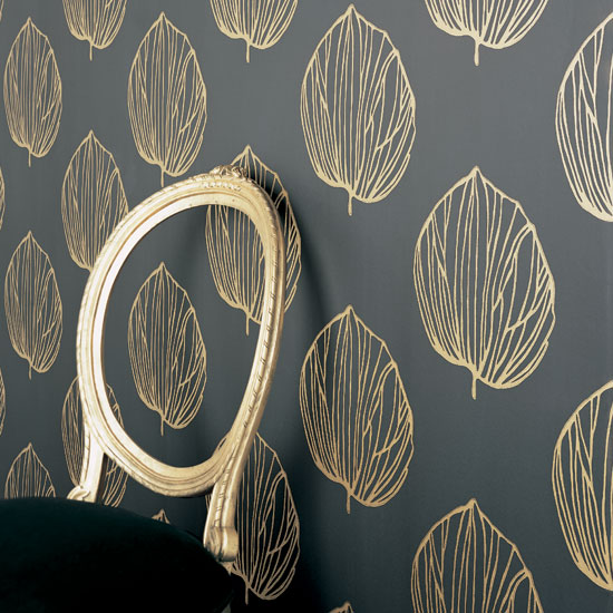
First of all, it is necessary to mention the vegetable print. It can be different in size and thickness of the lines. It can be used in combination with wallpaper of other colors, and on its own. Suitable for decorating a room in almost any style.

Botanical pattern trim
The second most popular is the classic print. It exists in the different options, it can be both monograms intertwined with each other, and separate wreaths, as in the photo. Options on a white background are used to complete the decoration of any room, on a dark one - most often in the form of combinations with other types of wallpaper.

classic ornament
When decorating rooms in the classical and baroque style, two types of patterns are often used at once: stripes + classic or stripes + floral. Thus, the zoning of space is carried out. In the photo you see that there is a division into rooms into a dining area and a relaxation area.

Classic ornament and stripes
Note:The use of story drawings can be very interesting. At the same time, the whole room is pasted over with plain golden wallpaper for the walls, and the drawing is located on one of the walls.
Story drawings in the design
Gold wallpapers are always associated with luxury, wealth, material wealth. Golden wallpapers in the interior are of particular importance. They were used to decorate palaces and castles. The magic of golden color has always attracted special attention. Currently, the gold color is still used in the interior style. Designers choose it for decoration country houses and urban apartments, making gold wallpaper a real fashion brand.
Rules for using yellow
Yellow wallpaper must be correctly applied in the interior. There are certain rules regarding the use of yellow wallpaper in home design.
1 rule. If you are decorating a wall with yellow wallpaper, you need to clutter it up with massive gilded objects and lots of furniture.
2 rule. Yellow wallpaper should be combined with gold threads and embossing on textile elements used in interior design.
3 rule. Yellow wallpapers should be used in moderation, you can choose canvases with a beautiful geometric pattern or flowers.

The nobility of yellow
The yellow tone is associated with the nobility of gold. In order for it to look appropriate, it is necessary to “dilute” it with an additional shade. For example, yellow wallpaper on the wall can be with a gray pattern. If you use green or blue canvases with thin gilded threads to decorate the walls, you can complement them with gilded candlesticks, gilded bed legs, luxurious frames of mirrors or paintings.

Such details testify to the aristocratic taste of the owner of the dwelling. Massive furniture with artificially aged, soft colors, green canvases on the walls, gray curtains on the window openings look interesting.
Advice! For lovers of luxury, interior professionals recommend complementing the gilding with black or gray shades.
Not sure if greens and grays can be paired with blacks and yellows? In that case, study helpful tips offered in the video fragment
Style decisions
Do you want to use gray or black colors when decorating the interior of your room? In this case, it is important to take into account the features of the chosen style. For example, in the shabby chic style, furniture elements and decorative accessories are highlighted in gold, and the walls can be gray or black.

For classical baroque, it is allowed to use a combination of gold color in textiles with a black or gray tint of figurines.
Attention! Warm golden color goes well not only with light tones, but also with gray and black objects.
If gray or white colors are chosen when decorating the walls, then choose peach or beige shades for bedspreads and pillows in the interior, embroidered with gilded threads.

Terracotta interior, as well as black and chocolate shades goes well with luxurious yellow. To give the created interior a sense of luxury and nobility, you can use furniture made of natural solid wood, as well as curtains in a rich brown tone.
The use of a combination of black and gold dominant shades in the interior contributes to an amazing result, the result of this combination will be an individual and amazing style. In such a tandem, it is black that should act as the predominant shade.

Advice! You can choose a black furniture set with gilded legs and handles. Black bedspreads and decorative pillows, painted with gilded threads, look divine.
The room has a sophisticated look, in the design of which turquoise shades are used, complemented by gilded decor elements.
Interior professionals consider real fashion trend of the season, a combination of golden and purple hues.

gold in the bedroom
The color of the noble metal fits perfectly into the bedroom, decorated in art deco or baroque style. Oriental style fans can use numerous golden accessories.

Wallpaper with luxurious gold embossing helps to create a unique atmosphere in this room and home comfort. Additional gold stucco on the ceiling, original figurines with a noble patina, slightly gilded frames for mirrors and paintings, yellow lamps help emphasize the elegance of the Baroque.

Modern bedrooms are trying to decorate in light shades, which are suitable for all varieties of gold.
luxury living room
Noble luxury and graceful aristocracy are emphasized in the living room by the golden color. Wallpaper, made in gold, in such rooms are considered the main detail of the interior. A furniture set of black, beige, brown color is suitable for this type of trellis.

Prefer to choose beige and light shades for the interior, in which case you can complement them with golden tones on flowerpots, lamps. The main rule is asymmetry. In this case, the details will have a more spectacular and attractive appearance.

An interesting solution would be to place a picture in a gilded frame on one of the walls, and no decorative elements are expected on the opposite wall. The presence of curtains with gilded threads on the window openings will be a kind of allusion to the solvency of the owner of the apartment.
In this case, additional lighting of the walls will act as an actual element. For example, miniature lamps with a gilded frame can be fixed on both sides of the picture.
Bathroom decoration in gold
With the help of gilded decor elements, you can emphasize the aristocracy and sophistication of a spacious, bright bathroom. If there is not enough lighting in it, in this case it is possible to correct such a deficiency with the help of the color of the noble metal. But when designing a small room, you run the risk of further reducing the available space.

Advice! For small bathrooms, you can choose a gold finish on plumbing fixtures and furniture.
Interior designers recommend using the gold jewel not throughout the room, but to accentuate only individual interior details with it. We offer some tips, thanks to which you can make only a slight hint of wealth and luxury:
Among the innovations taken from the interior fashion of the 18th and 19th centuries, it is necessary to note the use of the classic combination of mirrors in gilded frames with delightful screens made of mirror plates.
Interior professionals advise using a variety of art objects for modern interior. For example, you can paint a picture of impressive size in gold, or attract attention with gilded figurines mounted on coffee table. In the kitchen, it would be appropriate to design a mosaic apron in the color of precious metal.

Conclusion
Currently, interior designers are resorting to a combination of black and gold colors more and more often. The reason lies in the unique image that will eventually form. Fans of a classic interior can safely purchase materials with gilded threads and finishes.
The main rule that is important to consider when using yellow and gold shades in the interior is not to overdo it with these colors. With the right combination of noble metal color with other delicate shades, you can create visual effect spacious and bright room.
Color has long ceased to be just the name of the color of an object. IN modern world not only psychologists, but even ordinary people recognize the influence of different shades on the psycho-emotional state of a person. Therefore, it is incredibly important what tones and colors surround us, because they can play a key role in behavior, have a strong influence on our mood.
How yellow color and its shades affect the psyche
As you know, the color of gold is derived from yellow. What associations do you have with the words: sunflower, sun, chicken, emoticons? Of course, the following: warmth, summer, high spirits, joy, activity. It is not for nothing that yellow is considered the color of active and young people. If your apartment or room is decorated in this sunny warm color, it will stimulate the speed of brain processes and decision-making, yellow in the kitchen will activate appetite and improve digestion, in the nursery it will help the baby to be more dexterous and flexible.
But, like everywhere else, there are back side medals. The abundance of yellow, like the abundance of stimulation, can tire and lead to a state of moral and physical exhaustion.
And as a result, nervousness, loss of strength and even depression can occur. In addition, yellow, or rather some of its shades, are able to visually “eat up” space, which is simply fatal for small rooms. Therefore, it is necessary to carefully choose shades of yellow, and their quantity.
Gold is the king of flowers

It would seem that special in this color. Indeed, at its core, the shade of gold is a combination of yellow and orange, with its inherent specific brilliance of metal, which makes this color special. It will also be interesting that live and in photographs it looks completely different.
The thing is just in this metallic bewitching brilliance, which not a single monitor and not a single photo is able to convey. You should only look at gold live, and it doesn’t matter if it’s a fancy ring on the counter of a jewelry store or decorated walls of a palace.
Gold-colored wallpapers in the interior from the Middle Ages to the present
The golden sheen of walls and furniture always evokes thoughts of luxury and wealth. It gives a feeling of some special charming warmth and comfort. That comfort and gloss that was inherent in royal palaces and manor estates, and which is so lacking modern apartments. But here it is very important not to overdo it, because an overabundance of glitter and gold can create a feeling of boasting and boasting of the owners of the house, instead of the desired aura of sophistication and wealth.
This tone is used to create a chic interior in styles such as:
- Baroque
- Rococo
- Classicism
- High tech

4 basic rules for using gold-colored wallpaper
To highlight the best aspects of your interior, using gold-colored wallpaper and, at the same time, not to overdo it, pointing out the bad taste of the owners of the house, you need to adhere to four simple rules use of this color scheme in the design and decoration of premises.
- The most important thing is a sense of proportion. It should be understood that gold belongs to warm colors, which means that it cannot be used in large quantities, as it visually eats up space. An excess of this color is hard to perceive with the eyes, especially in abundantly lit rooms, where gold will also create glare. Experienced designers advise using it in a ratio of 1: 3, diluting it with other colors.
- If your sense of style is lame, then it is better to entrust interior decoration with wallpaper in gold color to professionals. After all, the main thing here is to make either one big accent, or several small ones. For example, if you decide to decorate the room with gold wallpaper, then everything else, with the exception of one or two small accessories, should be done in calmer colors.
- Strict compliance with one style is extremely important when you work with gold. If your wallpaper sparkles with classic monograms, or has numerous patterns and ornaments, then Art Nouveau lamps and Arabic golden pillows will simply be out of place.
- Play with shades. Different tones of gold are inherent in different areas in interior design. Muted, stylized antique, will be appropriate in the classic design style with drawings, and shiny and bright - in different directions of modernity.

How to combine gold wallpaper with other colors
As mentioned above, gold is appropriate in the interior in a combination of 1: 3. And it is incredibly difficult to find a pair for him. It can only be noted that this color harmoniously combines with most light and pastel shades. A color combination such as gold with gray, white, peach or beige will create a feeling of lightness in the room, as well as promote rest and relaxation.
A special radiance and richness will give the room a combination of chocolate furniture and golden wallpaper. It is also interesting that manufacturers often choose some kind of basis for skillful monograms or drawings. So, on sale we can often see red, brown, blue, blue, burgundy, white or gray wallpaper with gold patterns.
For lovers of stylish and expensive interior fit tandem of black and gold. With such an interior solution, you need to correctly place color accents. Do not dilute this combination with any other colors. Black in this combination should be the background, and gold will serve as wall decoration, door handles, furniture fittings, accessories.
What curtains to choose for golden wallpaper

Curtains for gold wallpaper for rooms such as a living room, bedroom or kitchen should be selected with great care. I take into account the specifics of this bright shade, most designers advise choosing curtains in soft light colors. The most commonly used: beige, muted light green, creamy light gray and other similar options.
golden wallpaper
Any color used in interior design is associative, and carries the main semantic load for all those who are in the room. Many associate the golden color with wealth and luxury, but besides this, do not forget that it is also a shade of yellow and is intended to bring joy and warmth to the interior.

The interior can be very harmonious
Hue characteristics
The use of golden wallpaper is acceptable in almost any interior, but in order for this shade not to spoil the situation, you need to pay attention to the following:
- Sense of proportion - this color is included in the category of warm. With proper use and sufficient lighting, it is able to expand the boundaries of any room and bring warmth into it. Keep in mind that oversaturation with this tone has the opposite effect, and everyone who is in the room has a feeling of discomfort. Therefore, in order not to spoil the perception of the interior of a room with golden wallpaper, you need to use it in a ratio of 1: 3, diluting it with companion flowers;
- A sense of style means that the use of this shade is not allowed everywhere, but only partially. And if gold-colored wallpapers are used in the design of the room, then a different color scheme should be used for the rest of the interior elements;
- Unity of style - the use of wallpaper with a classic print, pattern or stripes implies the presence of other elements in the interior, also designed in a classic style. At the same time, the presence of lamps and decor items in the Art Nouveau style is not allowed;
- The shade of the wallpaper should correspond to the direction of the interior itself. A more subdued golden color is always appropriate in a shabby chic room.
Please note! The color of the curtains, when combined with wallpaper of this shade, should be somewhat darker compared to the surrounding walls.

Photo: a luxurious holiday will be provided here
Color combination
You should not use too much golden color when decorating the interior, and moreover, you need to choose the right combination. To visually add light and space to the room, you should pay attention to light colors that go well with golden: gray, beige, white, peach.
If you need to focus on expensive furnishings, then chocolate-terracotta colors are used for the combination. For example, gold wallpaper will go well with dark wood furniture.
A special style brings a combination with black, and golden should be used only as a secondary color.

Photo: interior of a luxurious and soulful living room
Where to use
Creating the design of almost any room, you can use golden wallpapers in it:
- living room (hall) - golden is best combined with black, beige and brown;
- bedroom - golden in light shades is best used only as a pattern and print with pictures;
- bathroom - applicable in plumbing details, for decoration.
To create a quality interior, you have to use a variety of colors. Most often, designers get by with a standard palette dominated by white, black, red, green, yellow and blue shades, but in some cases exclusive options are also used. One of the colors that migrated from exclusive to ordinary is gold.
Well-chosen colors for the bedroomOf course, he has not lost his distinctive qualities, but is now used everywhere. Today we will tell you how to properly use gold wallpaper in the interior, what place to give them and how to maintain balance when decorating walls in this color.
Expensive shade of yellow
Today we have the opportunity to use any color in our interior. But before building a concise design, it is worth learning more about them and their influence on a person, his mood, psychological well-being.
Golden tone is obtained from yellow by adding some orange color and metallic sheen. Like yellow, it is filled with positive energy, warmth, good mood, a charge of vivacity.
The use of such bright colors yellow palette is considered the lot of young, energetic people. , is able to invigorate, energize, make the brain work, if it happens in the kitchen, then appetite also comes with activity.
 Luxurious bedroom furnishings
 But designers do not recommend covering all surfaces of the walls of the room with yellow.
- Firstly, yellow contributes to the visual compression of the room, it seems to you smaller than it really is. For small rooms, this is just a disaster.
- Secondly, after the stage of activity there is always a period of fatigue, and such an interior will not allow you to do this. As a result, from the annoying walls of the room, you may experience psychological exhaustion, apathy, and depression is not even an hour.
Here is such a great example of how thoughtfully you need to choose the colors and paints for the walls of your home. But back to our gold.
The golden color is not as simple as it seems at first glance. The successful combination of yellow and orange, ennobled by the original metallic sheen, makes this color truly bewitching. It is pleasant to look at it in any situation, whether it is a piece of jewelry, golden wallpaper on the surface of the walls or the decoration of the huge domes of the church.
It is also noteworthy that the golden color looks different in life and in the picture. Even modern technology is not yet able to convey the depth of the brilliance of this tone. This is partly why the color of gold is so loved and revered by many people.
Wallpaper in gold color
As in ancient times, so now, when you see the decoration of the walls of a room in this color, thoughts always arise about the wealth of the owner. Gold-colored wallpapers are designed not only to decorate the walls, but also to show the status of the room, its high level. Other design elements, made in gold, will indicate the unique luxury and luxury of the interior. In addition, gold radiates warmth, which adds coziness to a chic room. Oh, how nice it is to be in such a space.
 Exclusive textured wallpaper on the walls of the room
 But in pursuit of the beauty of royal palaces, the main thing is not to overdo it, and not turn the beautiful aura of luxury and wealth into tasteless boasting and gypsyism. The elusive line must be found in the process of developing the design of the room, and it is not worth crossing over.
Most often, wallpapers with a golden pattern or a completely golden tone are used in classical styles, but modern minimalism also allows the use of such pretentious shades.
To make it easier to work with this original color, the designers have developed a few simple guidelines that you need to remember in the process of preparing the interior of your dreams.
 Spectacular 3D wallpaper in the living room
 - Gold should be used in moderation, covering no more than a third of the wall space with it. Since the color of gold belongs to the palette of warm colors, it not only adds coziness and bliss to the room, but also visually reduces its space, as if bringing the walls closer to you. In addition, the metallic sheen that the color is equipped with will create a strong strain on the eyes in large quantities, and with artificial lighting it will be even more difficult to be in such a room.
- The color of gold is the main one, it is used either to create one, basic accent, or for a number of small ones, correctly distributed around the room. To create harmonious design, gold must certainly be diluted with light tones. If you do not see the strength in yourself to create a balanced interior, give this opportunity to a familiar designer.
- When designing an interior using gold paints, you need to choose one style and follow it clearly. When choosing classic monograms for wallpaper, you should not build a design in modern styles, and vice versa, if you have a simple, concise wall decoration, a large number of accessories, lighting and household items on which monograms are present, nothing.
Minimalism and hi-tech involve the use of plain canvases for the walls of the room, modernity is characterized by the presence of embossing and texture on the wallpaper, classic style indicate neat gold patterns and monograms on dark colors, East style reflected in large ornaments on the wallpaper.
 Representation of gold in modern style
 Shades of gold are designed to emphasize the direction you have chosen. For example, for classicism it is customary to use more faded tones, monograms, canvases with a complex pattern, while modern styles allow you to apply bright and juicy shades without patterns.
To comfortably place gold in the interior, you should correctly choose a pair for it, let's look at the most popular combinations.
Compatibility
The golden color is very strong, it is not advisable to choose an active pair for it, it is necessary to find background solutions that support the pressure and activity of this color.
Among the most popular options are the following:
- The palette of pastel colors does a great job of smoothing out the pressure of gold. White tones will add freshness, compensate for changes in space, and balance the interior. We often have white shades on many details, on the ceiling, because this is a universal and simple color. Beige shades will also be appropriate in their light manifestation. It is gratifying that beige and golden wallpapers can be presented in any room.
- With other shades of yellow and itself, the color of gold also coexists quite well. A warm and assertive interior can be perfectly presented in the kitchen space, in large bedrooms and even in children's rooms, where there is some zoning. Black and red accessories and household items are always capable of complementing this pair.
- Green shades combined with gold will be appropriate in the busiest rooms of your home. The combination of relaxation and warmth creates a comfortable aura for a person. In addition, green colors are so necessary for us in Everyday life. In classical interiors, green shades are most often represented by floral ornaments or geometry; monograms are used extremely rarely. Accent points with this combination can be red accessories.
 Saturated with flowers beautiful interior
 - Blue shades look very elegant and pretty as a couple. Blue tones with their freshness compensate for the warmth of gold, harmoniously complementing it. This spectacular pair is used to recreate ancient interiors, luxurious and unique, in which gold monograms cover blue walls. By the way, if the blue monograms cover the golden walls, the interior looks just as good. This combination was frankly peeped contemporary designers from their old colleagues, who were also very fond of monograms and ornate drawings.
- Brown shades are designed to create a classic restrained style in the interior, inherent in noble people. brown wallpaper interspersed with gold tones look very elegant. The picture is complemented by furniture made of natural wood, blackout curtains and light tulle. There should be a lot of light in this room, so if natural lighting is not enough, use more artificial.
- With deep rich colors the gold looks amazing. For beautiful classic interiors, red, burgundy, blue, purple tones are used. In these combinations, passionate, strong, assertive interiors are born, more suitable for living rooms, halls, rooms for receiving guests. For a bedroom, such colors would be inappropriate, although we like dark red interiors so much.
 Burgundy wallpaper with golden damask pattern
 - On a black background, the gold color looks very impressive. The contrast that black shades embody allows it to stand out in front of us. But for interior decoration, such a pair will be too dark. Therefore, the interior uses black details with gold inserts, monograms, and patterns. They complete the overall picture of luxury and nobility.
As you can see, there are a lot of decent colors to combine, almost the entire palette of classic colors is involved. But in order for you to finally decide on your choice, let's say a few words about the use of the color of gold in different rooms.
Application
Let's start with such a close, dear and most important bedroom.
Bedroom
Classic styles: baroque, art deco, rococo, perfectly represent the color of gold in your bedroom. Design with an emphasis on luxury and richness of antiquity, will allow you to create a great individual space. Gold will add gloss and shine to your chambers.
You can create a strong golden accent in the bedside area using a bright color, monograms, patterns, or paste wallpaper in a slightly faded tone, without a pattern, with some embossing, around the entire perimeter of the room.
 Bedroom renovation completed successfully
 White and its tints will help to lighten the design, it will add freshness and adjust the space. Wallpaper in gold color will not disturb the space of the bedroom, so it is permissible to use them in rooms with different dimensions.
Burgundy, red tones will help to create a luxurious bedroom, which on wallpaper with a relief will seem like velvet or silk. Passionate burgundy shades combined with golden tones will create a unique atmosphere of sensuality and tenderness. No wonder this combination of colors was one of the favorites of the nobility of past centuries.
Living room
A solemn, aristocratic interior cannot take place without gold. Applying this color, we set the pompous style of our living room, hall, large room. Moreover, we can vary the degree of severity, with the same wall coverings, with the help of furniture.
Choosing wooden furniture in light colors, we lighten the atmosphere, make it more relaxed, while dark, high-quality wooden furniture, an aura of seriousness, rigor, some intimacy appears.
 Decent mix of old and new
 Undoubtedly, the most winning style for a living room with the use of gold will be a classic. But in order to build a really high-quality interior, in addition to wallpaper, you will need good furniture, curtains, household items and accessories. Here, more than ever, black details with gold accents will be appropriate.
Other premises
Gold color in the kitchen is not common, silver motifs are more often used. But at the same time, it can be applicable for finishing some surfaces. This one will easily fit in, even beige, even white, and will increase your appetite.
In the bathroom, wallpaper is used extremely rarely, but durable modern vinyl sheets, can be completely glued on walls that do not have direct contact with water. The gold color in this room will perfectly complement the nautical theme of blue or blue.
If you want to use the color of gold in the hallway, first take care of high-quality lighting. Later, together with artificial light, the metallic reflections of gold will help to slightly increase the space in this place. Black paint in the hallway will be out of place, so choose brown furniture.
 For large houses, such an interior in the hallway is also appropriate.
 Curtains for wallpapers made in gold tones are best chosen in neutral shades: white, beige, gray. For classic interiors, it is permissible to use thick dark curtains made of quality materials together with light tulle. The same patterns and monograms on wallpaper and curtains will look very cool.
In conclusion, I would like to note that the use of wallpaper made in gold tones will create a festive, solemn atmosphere in which special attention will be paid to luxury and wealth. Use this color in moderation, create an interior in the same style, choose a high-quality color pair, and then you can enjoy the beauty of your room for a long time.